




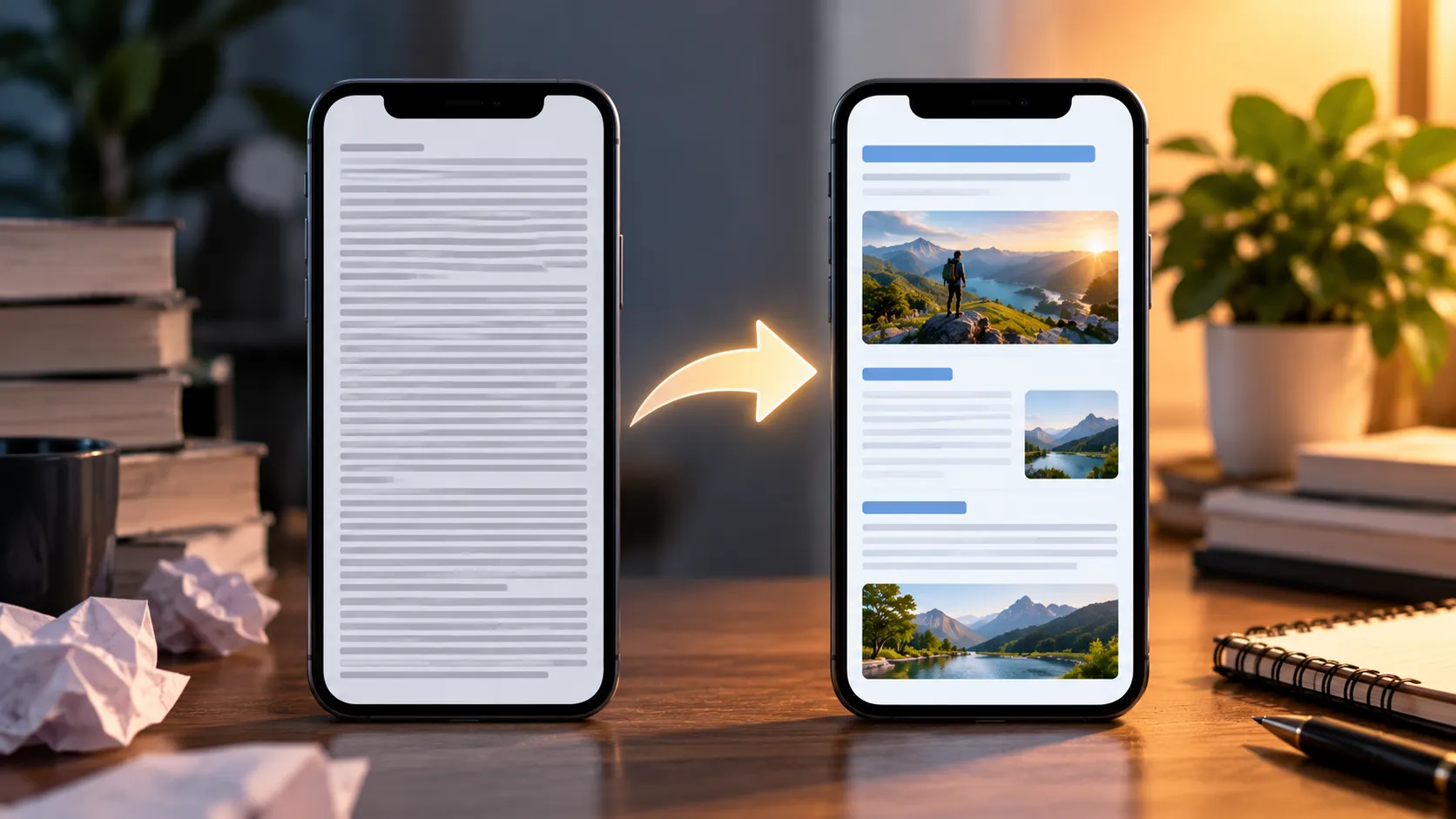
I used to treat formatting as the final step after writing and SEO.
Then I reformatted some older articles.
Shorter paragraphs, clearer headings, better image placement, and more white space made the content much easier to consume—especially on mobile.
1. Keep Paragraphs Short
I usually aim for 2–4 sentences per paragraph.
There isn't a magic Google-approved paragraph length. The goal is simply to make the article comfortable to read on a phone.
2. Use Clear Subheadings
Instead of generic headings, use headings that tell readers exactly what they'll learn.
For example:
Weak: Additional Thoughts
Better: Why Your Featured Image Matters
3. Use Images With Purpose
Don't add images just to fill space.
Use images to explain an idea, show an example, support the story, or make the article easier to understand.
Google also recommends relevant, high-quality images for Discover. See the Google Discover guidelines.
4. Use Bullet Points When Helpful
Lists make information easier to scan.
But don't turn every paragraph into a list. Use bullets when they genuinely simplify the information.
5. Cut the Long Introduction
I stopped starting articles with generic explanations.
Now I get to the useful part faster.
If the article promises a lesson, experience, or result, I introduce that early.
6. Put the key point in the first two paragraphs
Discover readers arrive from a card in their feed, not from a search query. They clicked because the headline and image made a promise. Confirm that promise immediately: state the main finding, answer or story in the opening lines, then add detail. If the payoff is buried halfway down, many readers leave before they reach it.
7. Write headlines that are clear, not clickbait
Google's Discover guidelines specifically warn against headlines that exaggerate, withhold key information to create curiosity, or use shocking language. Good Discover headlines are specific and honest:
- Weak: You Won't Believe What Happened to My Traffic
- Better: How Rewriting One Article Doubled My Search Impressions
A clear headline tends to earn clicks from the right readers, who then stay on the page. That satisfaction matters more for long-term Discover visibility than a short spike in clicks.
8. Make the featured image do real work
The image is often the first thing people notice in Discover. Use a high-quality image at least 1200px wide, and make sure your pages allow large previews with the max-image-preview:large robots setting. Avoid using your logo as the main image, and avoid images with lots of small text that becomes unreadable on a phone.
9. Use tables and comparison blocks for data
When you compare options, prices or dates, a simple table is much easier to read on mobile than several paragraphs. Keep tables narrow (three or four columns) so they don't need sideways scrolling.
10. Break up long sections with visual anchors
Pull quotes, short highlighted takeaways and numbered steps give scrolling readers places to pause. One visual break every 300–400 words is a good rhythm for most articles.
A quick mobile formatting checklist
- Body text is at least 16px and easy to read without zooming.
- No paragraph is longer than about five lines on a phone screen.
- Every H2 tells the reader what the section is about.
- Images are compressed and don't push text down as they load.
- Ads and pop-ups don't cover the opening paragraphs.
- Links are easy to tap and clearly labelled.
How to tell if formatting changes helped
In Search Console, open the Discover report and compare clicks and CTR for the reformatted articles over the 28 days before and after the changes. In your analytics, also look at engagement time and scroll depth for Discover traffic. If people stay longer and scroll further, the formatting is doing its job, even if Discover traffic itself varies from week to week.
Formatting is one part of a wider Discover strategy. For the technical side, see our guide to the max-image-preview:large tag.
What I'd Tell My Past Self
Stop formatting for desktop readers only.
Think about someone reading your article on a phone while casually scrolling.
Make the headline clear, the image strong, the introduction useful, and the content easy to scan.
Formatting won't fix weak content—but it can make good content much easier to consume.
For the technical and editorial checks I use before publishing, read My Pre-Publish Discover Checklist.
For the complete Discover strategy, read Writing for Google Discover — What Actually Worked for Me.