




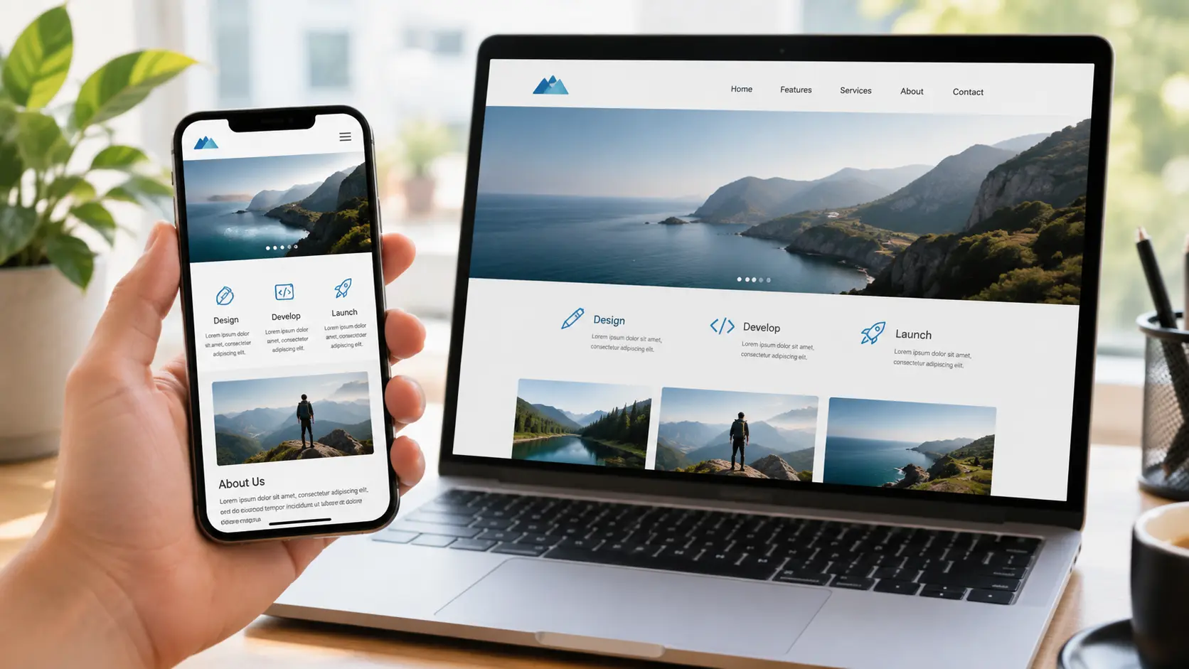
With most website visitors using smartphones, making your website mobile-friendly is essential for SEO and user experience. Free mobile-friendly test tools can help you identify layout, usability, and performance issues before they affect your visitors.
Why Mobile-Friendliness Is Non-Negotiable
Google uses mobile-first indexing, meaning Google primarily uses the mobile version of a website's content for indexing and ranking.
A website that works well on desktop but has mobile usability problems can create a poor experience for visitors and make it harder for users to interact with your content.
What Happened to Google's Mobile-Friendly Test?
Google retired its standalone Mobile-Friendly Test tool, the Mobile-Friendly Test API and the Mobile Usability report in Search Console in December 2023. Mobile-friendliness still matters for rankings and users, but you now need other tools to check it. The good news is that the free alternatives below give you more detail than the old pass/fail test did.
Free Tools to Test Mobile-Friendliness
Here are some useful tools for checking how your website performs on mobile:
- Google PageSpeed Insights — Test mobile and desktop performance and get recommendations for improving page speed and user experience.
- Chrome DevTools — Simulate different mobile devices and screen sizes directly in Chrome.
- BrowserStack Responsive — Preview how websites appear across different devices and screen sizes.
- Seobility SEO Checker — Check mobile usability along with other important SEO factors.
- SEO Site Checkup — Analyze mobile-related SEO and technical website issues.
Check Mobile Page Speed Separately
Don't assume that good desktop performance means good mobile performance. Mobile devices may have slower processors, smaller screens, and less reliable network connections.
Use Google PageSpeed Insights to test both mobile and desktop versions and review metrics such as loading performance and Core Web Vitals.
Common Mobile Usability Issues
Mobile testing can reveal problems such as:
- Text that is too small to read
- Buttons and links placed too close together
- Content wider than the screen
- Images that don't scale correctly
- Poor navigation on smaller screens
- Slow-loading pages
- Mobile layouts that shift while loading
Check Mobile Pop-Ups and Interstitials
Pop-ups should not make important content difficult to access, especially on smaller screens. Check your website on an actual smartphone as well as with testing tools to ensure banners, forms, and pop-ups don't block the main content.
How to Test Mobile-Friendliness in Chrome DevTools (Step by Step)
- Open your page in Google Chrome and press F12 (or right-click and choose Inspect).
- Click the device toolbar icon or press Ctrl+Shift+M (Cmd+Shift+M on Mac).
- Pick a common phone, such as a mid-range Android device, from the dropdown and reload the page.
- Scroll the full page and check for horizontal scrolling, overlapping elements, tiny text and hard-to-tap buttons.
- Open the Lighthouse tab, select Mobile, and run a report for performance, accessibility and SEO checks.
Core Web Vitals Targets for Mobile
PageSpeed Insights shows real-user Core Web Vitals data when your page has enough traffic. Aim for these "good" thresholds on mobile:
| Metric | What it measures | Good |
|---|---|---|
| LCP (Largest Contentful Paint) | How fast the main content loads | 2.5 seconds or less |
| INP (Interaction to Next Paint) | How quickly the page responds to taps | 200 ms or less |
| CLS (Cumulative Layout Shift) | How much the layout jumps while loading | 0.1 or less |
You can also see these metrics for your whole site in the Core Web Vitals report in Google Search Console.
Quick Mobile-Friendly Checklist
- The page has a viewport meta tag and no horizontal scrolling.
- Body text is at least 16px and readable without zooming.
- Buttons and links have enough space to tap comfortably.
- Images are compressed, sized for mobile and lazy-loaded below the fold.
- Pop-ups do not cover the main content on arrival.
- Forms use the right input types (email, tel) so the correct keyboard appears.
- The mobile version shows the same main content, headings and structured data as desktop.
Conclusion
Mobile-friendly testing takes only a few minutes but can uncover issues affecting usability, SEO, and conversions. Use Google PageSpeed Insights, Chrome DevTools, BrowserStack, Seobility, and SEO Site Checkup to regularly check your website's mobile experience and keep it fast, accessible, and easy to use.